Creating a behavior-aware
support platform for
executive dysfunction,
hyperfocus &
emotional regulation.
UI/UX, Accessibility design, Visual Design
Overview
Role
Solo designer: research, UX, UI, branding
8 weeks
Student Project
Timeline
Type
01 — THE PROBLEM
02 — THE RESEARCH
03 — The Users
Existing productivity tools were designed
for neurotypical users. For people with ADHD,
they create a paradox: the apps meant to help
become another source of overwhelm. There
was no platform that understood the difference
between hyperfocus, executive dysfunction,
and emotional dysregulation, and designed
for each specifically.
Two distinct user types emerged from research:
06 — KEY FEATURES
The platform was designed around four distinct ADHD challenges, each with its own flow:
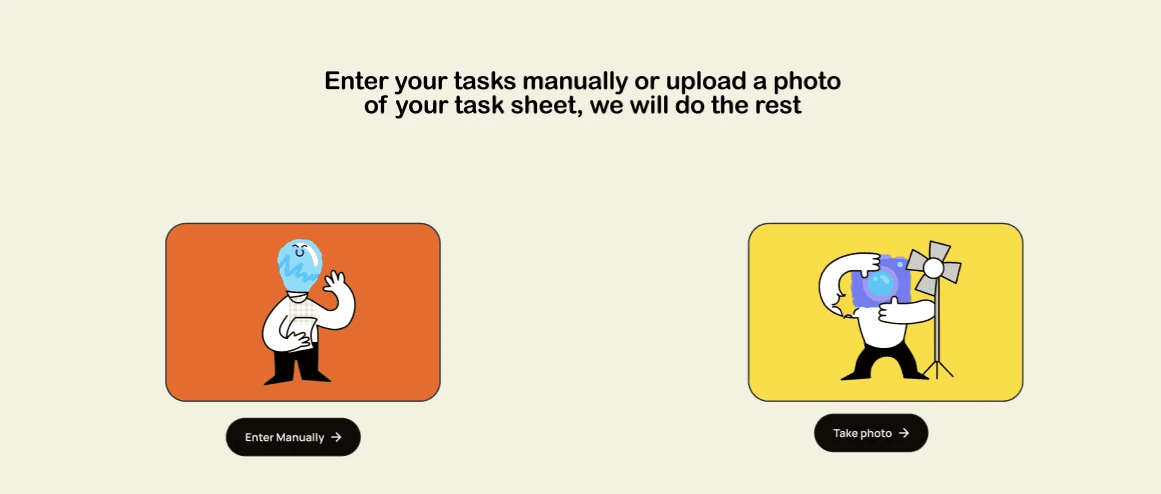
Time Management, visual, low-friction scheduling
Emotional Regulation focuses on anger and impulsivity, 2 emotions that are underrepresented in ADHD support platforms
Executive Dysfunction tools; Mini Games, Music and Rotting Routines all for specific conditions
The mini games are broken into 2 games of I bet you can't for focusing and Spin wheel for decision paralysis.
Hyperfocus Timer — READY → countdown → YAY reinforcement loop
Hyperfocus Mode
Time Management
Emotional Regulation
Executive Dysfunction
Removes all other distractions so that the user is forced to sit down and focus on their tasks. The finish screen is designed to interrupt hyperfocus
gently and let the user keep focusing after their set timer.
Task breakdown and prioritization
is essential but rarely done right
Most ADHD apps overwhelm users
with too many features at once
Users needed emotional check-ins,
not just task lists
05 — DESIGN SYSTEM
The brand identity was built to feel warm and human, not clinical.


04 — THE CORE DESIGN CHALLENGE
ADHD brains crave stimulation but break under too much of it. Every design decision had to answer one question: is this engaging enough to hold attention without becoming another source of overwhelm? This tension shaped everything, the color system, the typography scale, the way features were progressively revealed.


Spin wheel has the option to take tasks directly from task manager so that the user doesn't have to re enter everything.
Music bar with a set number of sound options which help in focusing and getting out of a slump, it is available on
every pages left bottom corner
Rotting routines makes a customized routine on basis of the users needs


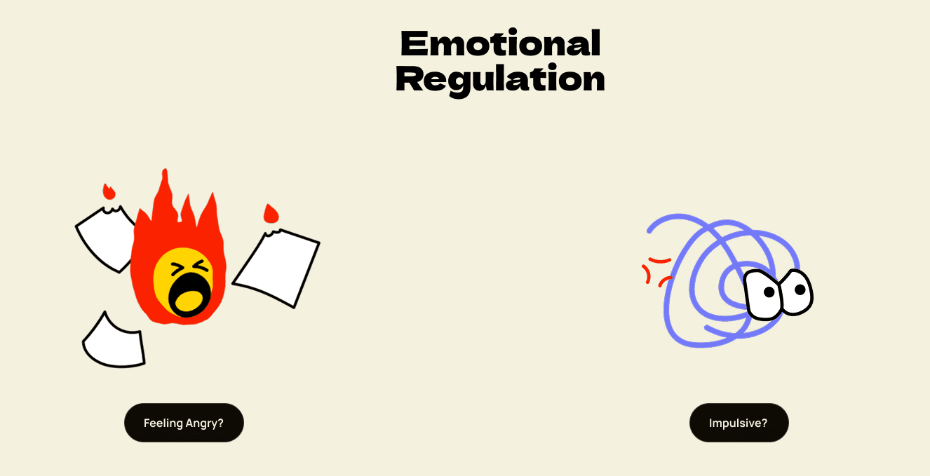

Impulsivity screen shows a slide component of various things one can do
before giving into their impulsive thought.


What I'd do next:
Conduct formal usability testing with ADHD users, prototype the hyperfocus timer as a mobile app, and test whether the color
customization feature increases user retention.

Anger screen shows a list of things one can do which will end up
changing the mood of the user
"I want something that is stimulating enough but also not too much."
- Prashant, research participant
The final platform reflects exactly that balance. Peer feedback validated that the visual language felt approachable rather than overwhelming, and that the feature separation rather than a single dashboard reduced cognitive load significantly.
07 — THE OUTCOME
To understand the real problem, An in-depth survey was run with 67 participants and 5 personal interviews were conducted with
ADHD individuals across different life stages.
The most repeated frustration wasn't "I can't focus", it was "I get so caught up in one thing that I forget everything else."
Key findings:
01 — The Overstimulation Problem
In surveys, the most repeated frustration wasn't an inability to focus, it was the apps themselves becoming a source of overwhelm.
Too many features, too much information, too many decisions at once.
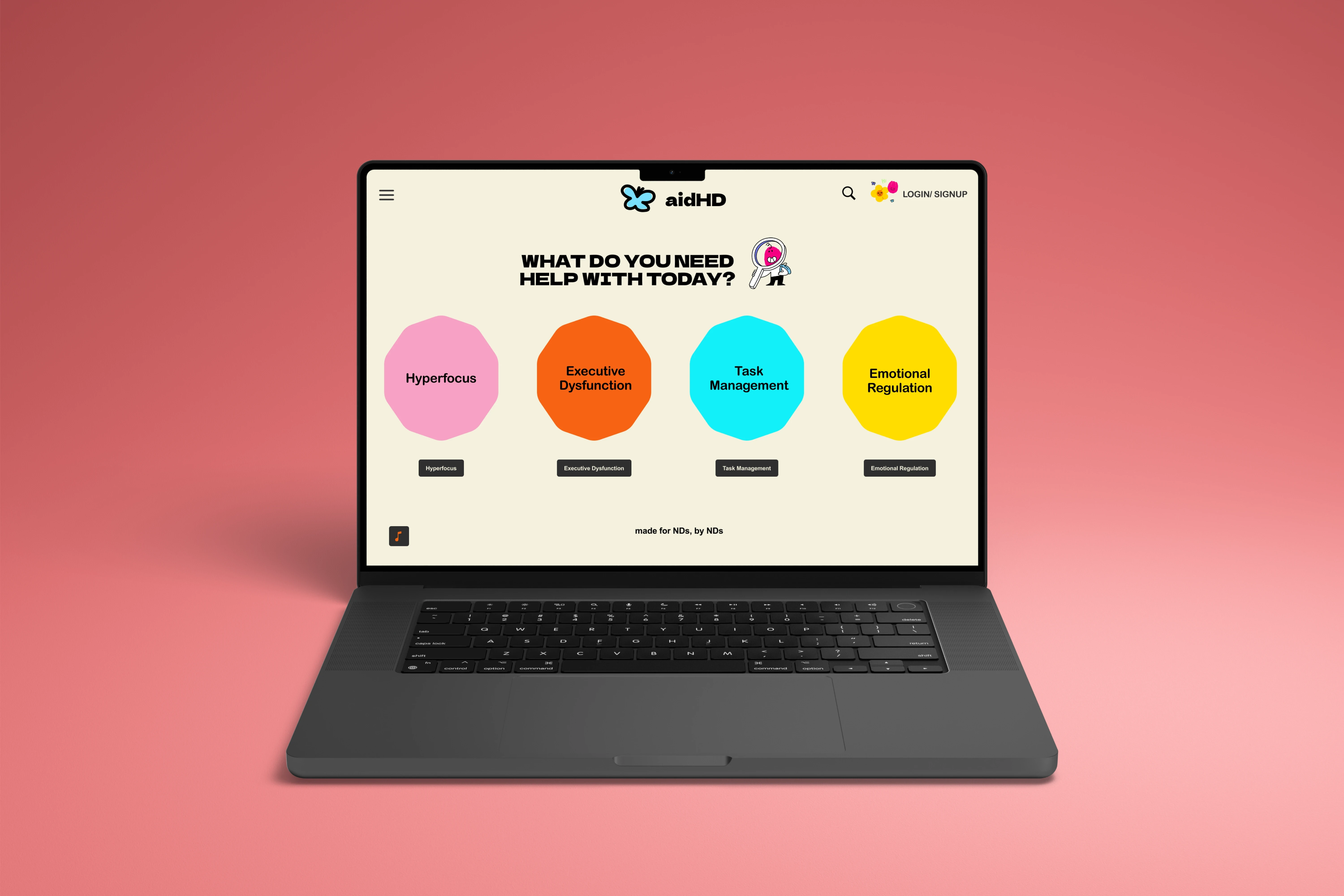
Therefore: The home screen presents exactly one question, "What do you need help with today?"
with four distinct categories. No dashboard. No feed. No widgets. The user chooses their context before the platform shows them
anything else.
03 — Colour as Navigation
Users with ADHD often struggle with reading-heavy interfaces scanning for the right option takes cognitive effort they don't have
available.
Therefore, Each of the four feature areas was assigned a distinct color from the palette Rosie for hyperfocus, Naarangi for executive
dysfunction, Aqua for task management, Yello for emotional regulation. Color does the orienting work so the user doesn't have to.

04 — Positive Reinforcement
Both personas Akira and Prashant explicitly needed positive reinforcement to stay engaged with a tool. Prashant specifically
mentioned needing to feel attached to it.
Therefore,The hyperfocus timer ends with a YAY state, not just a stop. Completion moments across the platform use the illustrated
character system to celebrate rather than just confirm.
05 — The things I decided to not build
An early concept included push notifications to interrupt hyperfocus and remind users of tasks. It seemed logical, if users lose track
of time, remind them.
After research, I removed it. Participants consistently described notifications from productivity apps as anxiety-inducing rather than
helpful.
An unexpected interruption for an ADHD user can derail an entire work session. The hyperfocus timer works instead as a user-initiated
interrupt, they set it when they're ready, which keeps them in control.
Apart from that, I created a website version of this platform first since this is supposed to aid people feel more productive and I did not
want this to become another of the apps people download and do not use, but instead something people willingly open.


02— Four Problems, not one
Research revealed that ADHD isn't a single experience. Hyperfocus, executive dysfunction, time blindness, and emotional dysregulation
are distinct challenges that require different kinds of support and users were frustrated that existing tools lumped them together.
Therefore, aidHD was structured as four separate feature flows rather than one unified tool. Each mode has its own visual language,
interaction pattern, and emotional tone so a user managing a hyperfocus spiral isn't confronted with emotional regulation content, and vice
versa.
Creating a behavior-aware support platform for executive dysfunction, hyperfocus & emotional regulation.
Resume
About


What I'd measure if this shipped:
Task completion rates per feature, session length vs. overwhelm drop-off points, and whether color customization correlates with retention.
CASE STUDY • 5 MINUTE READ
Read Next: Redesigning how visitors move through, discover, and connect with modern Indian art at the NGMA.
Resume
