Reimagining how a new
generation of visitors
discovers, navigates,
and remembers
modern Indian art
at the NGMA.
UI/UX, Service Design, Interaction Design, Brand Strategy
Overview
Role
Solo designer: research, UX, UI, branding
18 weeks
Digital + physical touchpoints, Student project
Timeline
Type
01 — THE PROBLEM
02 — THE CONTEXT & RESEARCH
Three principles anchored every decision:
Accessibility first,
Physical and digital as one system.
The static becomes dynamic.
Creating a behavior-aware support platform for executive dysfunction, hyperfocus & emotional regulation.
Resume
About


04 — THE DESIGN STRATEGY

CASE STUDY • 5 MINUTE READ
The National Gallery of Modern Art holds some of India's most significant modern art, but its visitor experience hasn't kept pace. Wayfinding is unclear, digital presence is minimal, and for younger audiences especially, the museum can feel like an instagram spot rather than an art experience.
The challenge wasn't to make NGMA trendy. It was to make it accessible, to lower the barrier between a visitor and the art, without erasing the institution's heritage and weight.
05 — WEBSITE REDESIGN
03 — THE EXISTING EXPERIENCE
The current NGMA website is built on Google Sites, a platform designed for documents, not experiences. The navigation contains over 20 items including RTI filings, tender notices, and cyber awareness pages, all at the same visual weight as Exhibitions and Events. A first-time visitor looking to plan a trip or explore the collection has no clear path.
The information architecture reflects the institution's internal structure, not the visitor's intent. The redesign's first job was to fix that.


Navigation: from 20+ to 6
The original navigation is organized around institutional function; RTI, Tenders, Announcements. The redesign collapses this into 6 visitor-intent categories: Exhibition, Events, Parikraman, On the Air, Collections. Every item answers the question "what do visitors actually come here for?" not "what does the institution need to publish?"
Homepage: clarity over comprehensiveness
The original homepage surfaces everything at once with no hierarchy. The redesign leads with a clear orientation grid, five colour-coded sections that tell a visitor immediately what NGMA offers and where to go. Color does the wayfinding work before a single word is read.
Collections: discovery over search
The collections page uses a scattered masonry layout rather than a grid. This was a deliberate interaction design choice art discovery should feel like wandering a gallery, not browsing a database. The layout rewards exploration rather than directed search.
Each collection opens up to their own pages with history, collector and artist details which were not present in the website before.
Parikraman: making digital a first-class experience
Virtual tours were buried in the original. In the redesign, Parikraman sits in the primary navigation as its own destination recognizing that digital visitors are real visitors, and that virtual tours are an acquisition tool for physical visits.
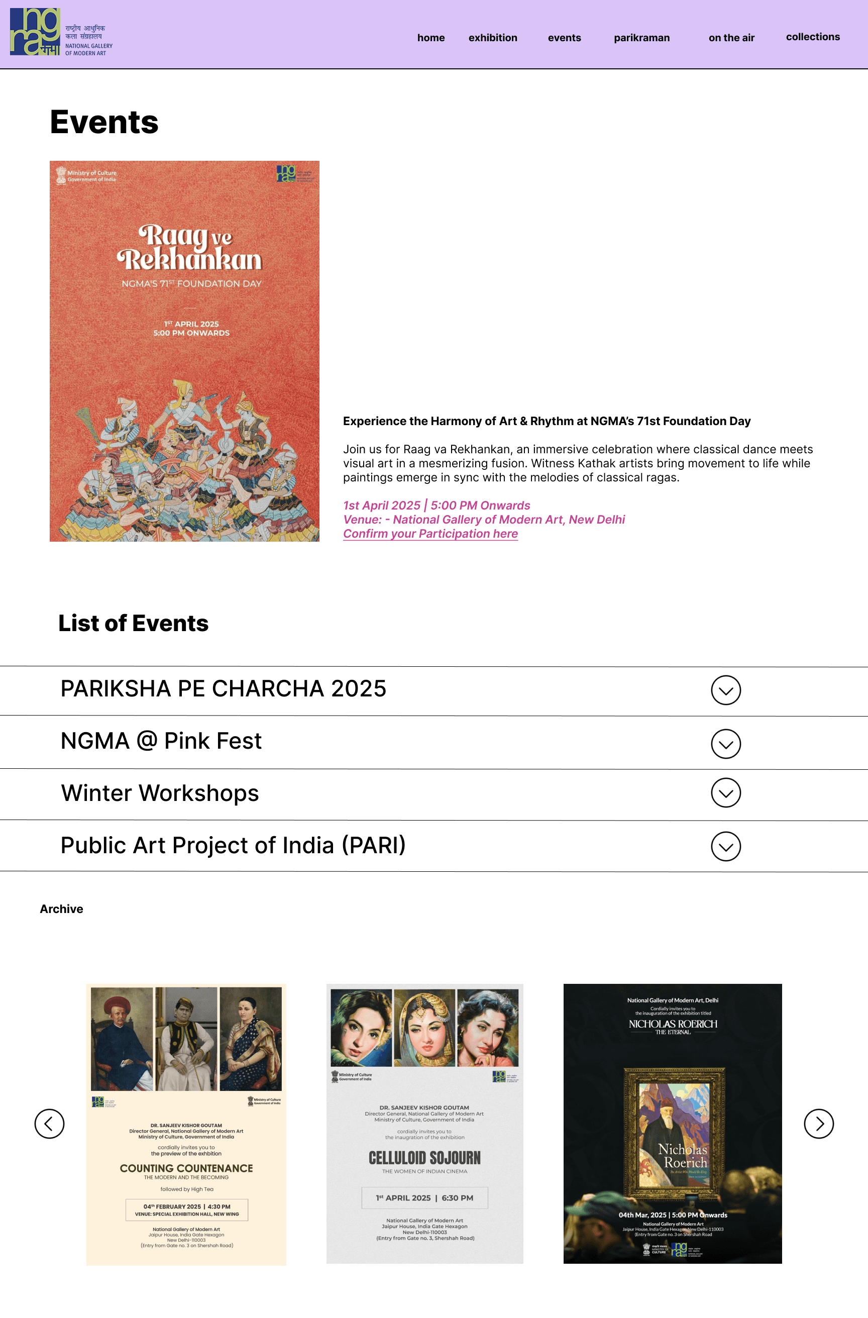
Events: surfacing what's happening now
The original buries events in a sub-navigation. The redesign features the current event prominently at the top of the events page with full context, then provides an accordion list and archive below. Hierarchy matches urgency.
Exhibitions
There is no exhibitions page which lists current and past shows in one page
A visitor planning a trip has to scan through each and every exhibition page to find what's actually on now.
Therefore: The redesign separates current exhibitions into a clear 3-column featured grid at the top each show gets a full gallery photograph, its name, and a direct "Learn more" CTA. No clutter, no ambiguity about what's happening now.
Archive sits below as a distinct section, accessible for researchers and returning visitors, but not competing with the primary visitor task of "what can I see today?"
The photography-led cards were also a deliberate choice. Exhibition titles alone don't create desire to visit, seeing the gallery space does. Each card shows the physical room, not a poster, because the decision to visit is emotional before it's information



The Installation — Where Interaction Becomes the Art
This is the centerpiece of the experience redesign. Traditional gallery installations are observed. This one participates.
The play of light and shadow on geometric forms creates an evolving visual experience paintings that shift with changing perspectives, blurring the boundary between two-dimensional art and interactive space. The static becomes dynamic.
UX principle at work: when a visitor's physical presence changes what they see, they stop being an audience and become part of the work. This is the moment the museum becomes memorable.
06 — TOUCHPOINTS AND UX RATIONALE
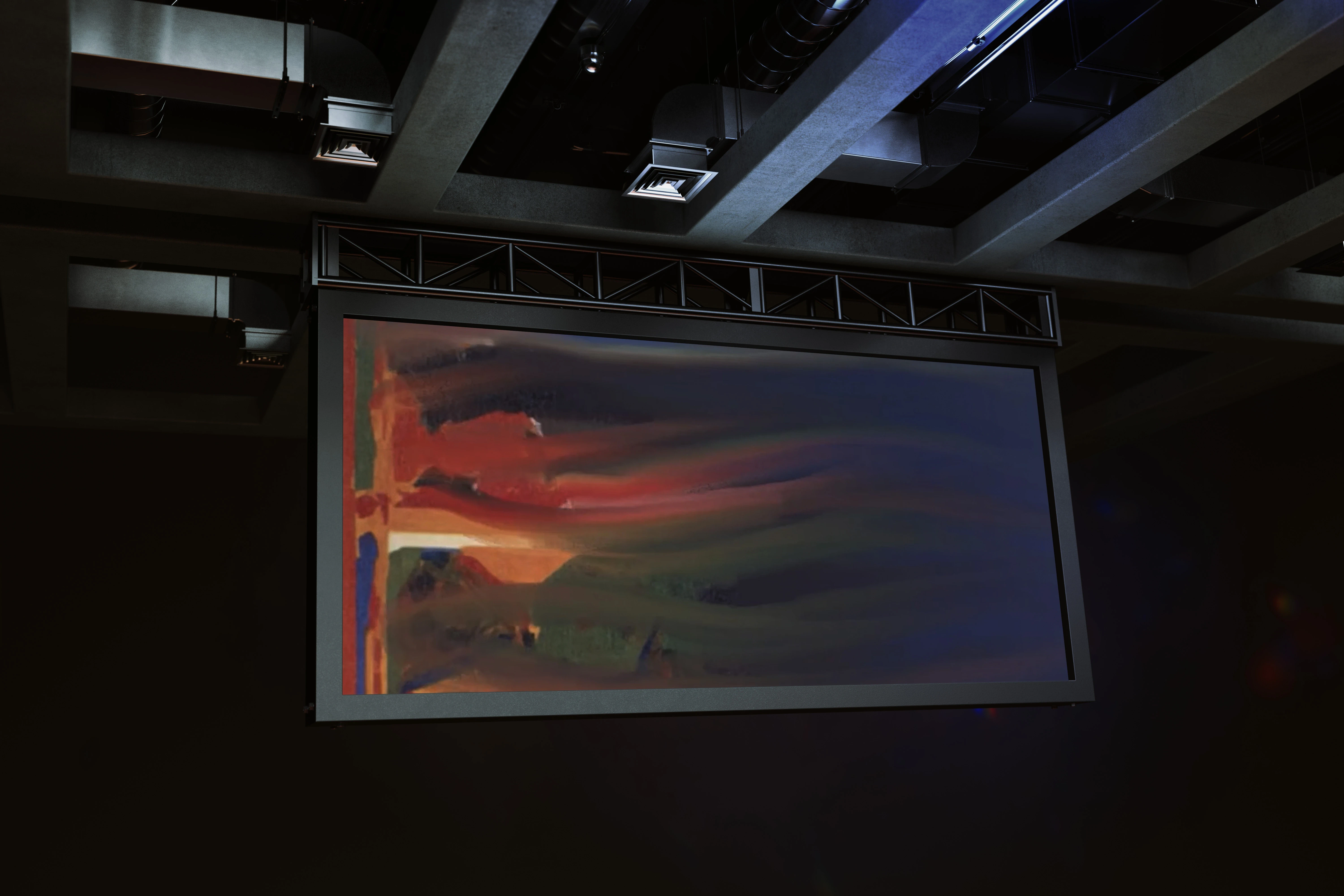
One of the few art installation videos
Ticketing & Brochures — The Entry Moment
The entry experience sets the emotional tone for everything that follows. A transactional ticket creates a transactional mindset.
Therefore: Tickets and brochures were redesigned as collectibles. The double function (functional document + keepsake) turns
the entry moment into the first act of engagement.
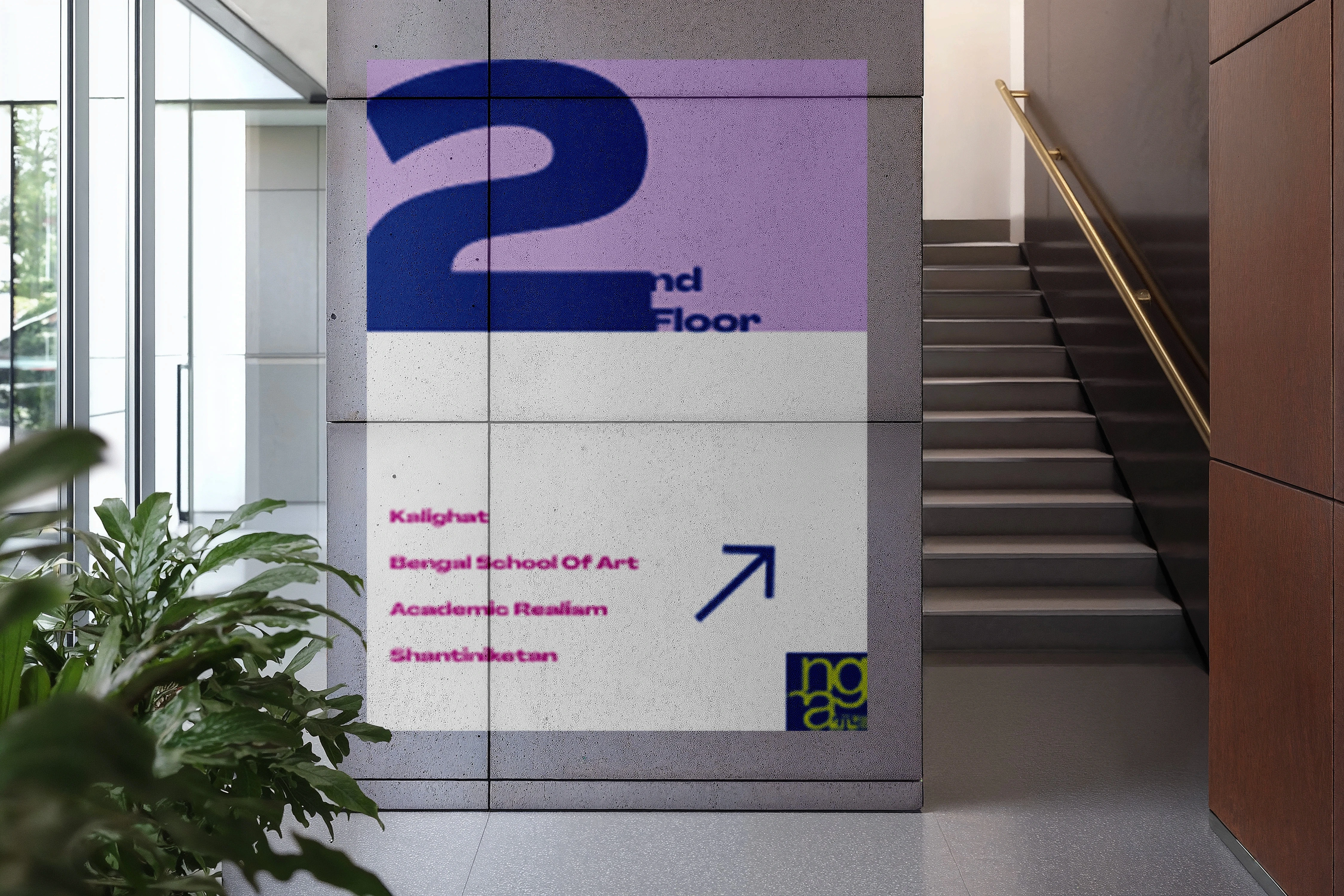
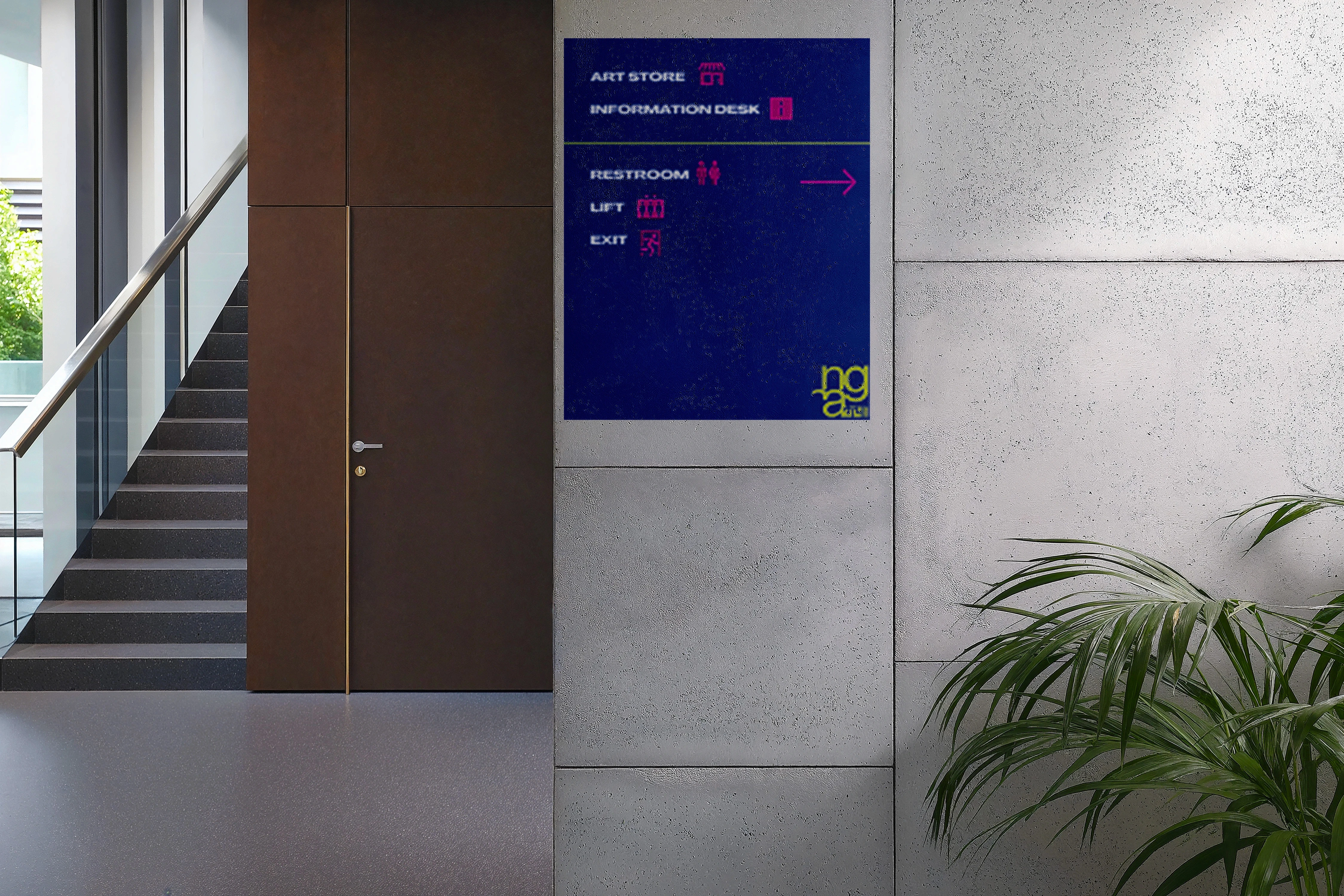
Wayfinding & Signage — The Gallery Floor
Visitors lose orientation quickly in large gallery spaces, especially when content is dense and text-heavy. Anxiety about "doing it wrong" is a real barrier to engagement.
Therefore: Signage was redesigned around clarity and visual hierarchy, using the established color system to create intuitive zones. UX goals: reduce decision fatigue on the floor, make navigation feel like exploration rather than instruction-following.
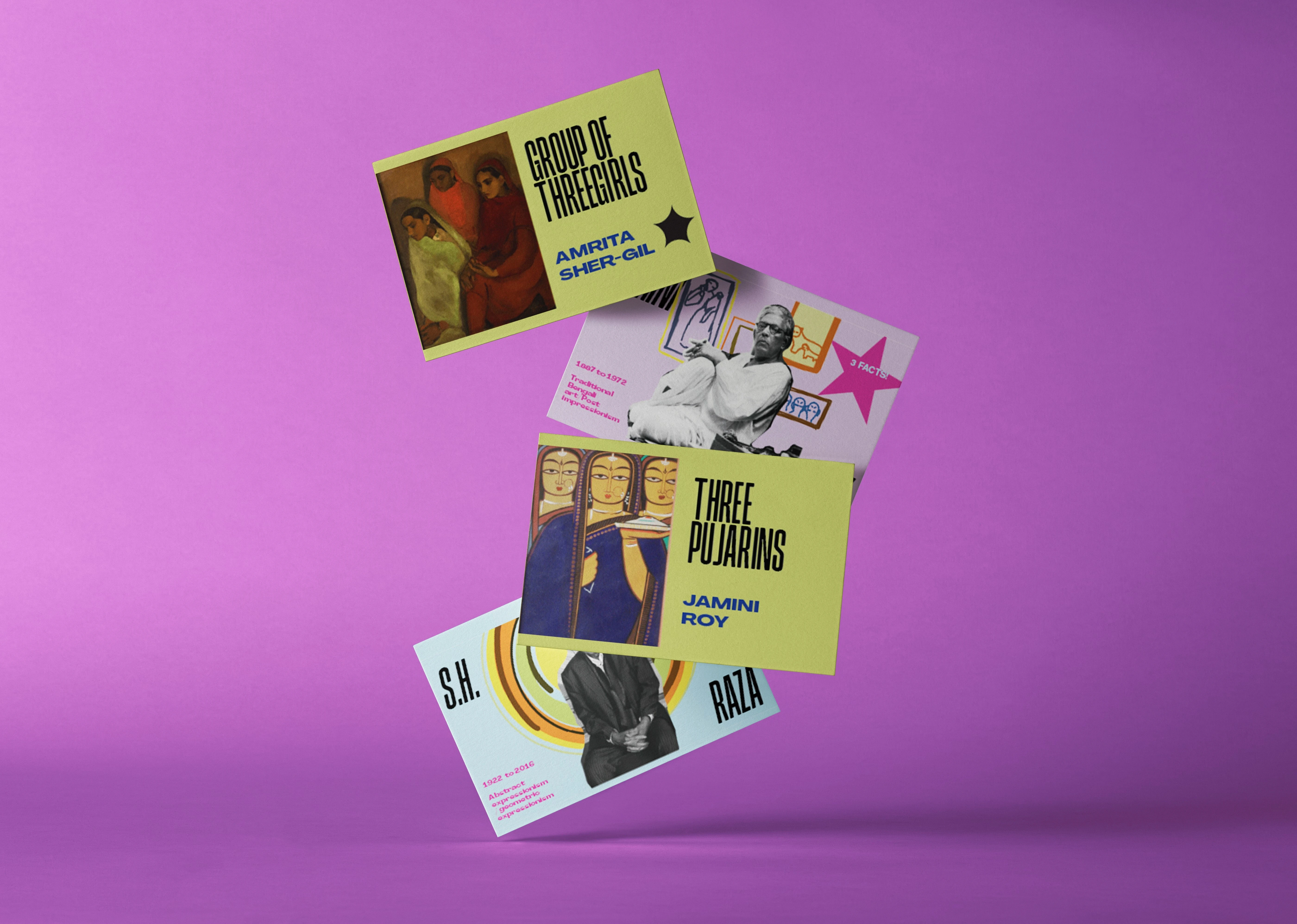
Artist Cards — Information Without Overwhelm
Art context matters, but wall text actively doesn't actively younger visitors. The information exists, but currently it is passive; leaving the viewers with no information that is retained it just needs a different format.
Therefore: Artist cards distill each work into a scannable, collectible format. Designed for both physical use in the gallery and digital sharing the same card works as an in-hand object and a social media moment. This extends NGMA's reach beyond the building and helps with viewers remembering what they saw, and create a personal memory.



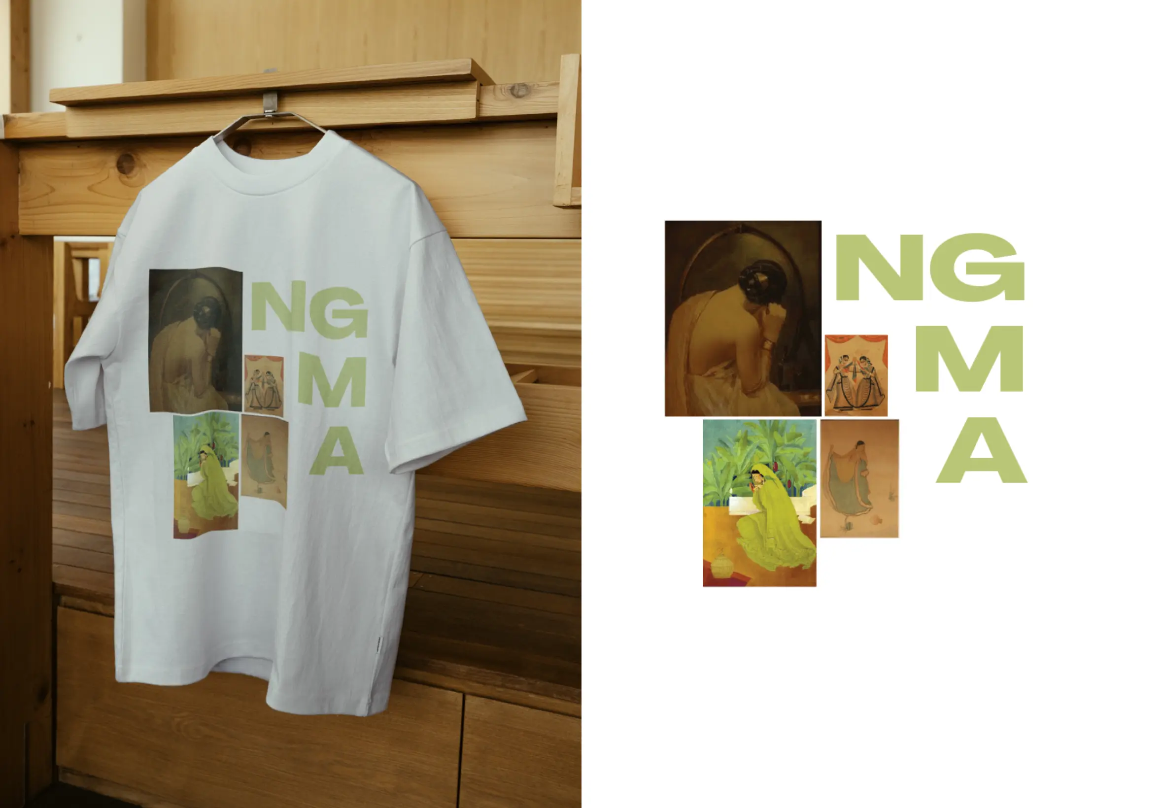
Merchandise — The Museum Leaves With You
Museum merchandise is often generic. A tote bag that could be from any institution doesn't build loyalty to this institution.
Therefore: Merchandise was designed as wearable art rooted in NGMA's specific visual system, minimal enough to be worn, iconic enough to be recognized. Every piece is a portable extension of the gallery identity.

Face Filter — Digital Engagement Touchpoint
Younger audiences document their experiences. Fighting that impulse is futile designing for it turns visitors into advocates.
Therefore: The interactive face filter brings NGMA's visual identity into the spaces where younger audiences already are. It's not a gimmick, it's a designed entry point that meets audiences where they are and pulls them toward the physical institution.

Museum experience research consistently shows 2 drop-off points for younger visitors: the gallery floor (no orientation, no narrative thread), and post-visit (nothing to take away, share, or remember).
NGMA's existing identity is rooted in a strong visual language, the navy and moss green of its logo, the architecture of the building itself. The redesign had to extend that language into a full experience system, not replace it.
THE RESEARCH
To understand the actual visitor experience, I visited NGMA in person and observed someone with no prior knowledge of art navigating the space independently.
What I found on the ground:
The gallery floor had no directional signage toward the main collection, visitors wandered without orientation. Art pieces were arranged with no distinction of genre, medium, or time period, making the collection feel like storage rather than curation. The painting information cards contained multiple typographic errors, undermining the institution's credibility. The primary audience present was young people in their late teens to twenties, exactly the demographic the experience was failing most.
The observational finding that anchored the whole project:
Watching a first-time visitor move through the gallery, the same three questions kept surfacing: "What is this art style?" "Who is this artist, what period were they in?" "What is this art medium?" The information existed, it just wasn't accessible at the moment of curiosity. By the time someone found context, the emotional connection to the work had passed.
What this told me:
The NGMA experience had two compounding problems, a broken physical journey (no wayfinding, no narrative) and a broken information layer (context inaccessible at point of need). The redesign had to solve both.
07 — DESIGN SYSTEM
Colors were drawn directly from NGMA's existing logo, navy #263B7E and moss green #B6C370. This wasn't a constraint, it was a decision: the redesign had to feel like NGMA evolved, not replaced.
Typography pairs a modern sans-serif with the institution's existing gravitas, approachable without being irreverent.


A full experience system spanning ticketing, wayfinding, merchandise, digital engagement, and spatial installation, each touchpoint designed around a specific visitor need, all connected by one visual language.
The redesign doesn't ask visitors to appreciate art differently. It removes the friction that was stopping them from engaging in the first place.
08— OUTCOME
What I'd do next:
Usability test the wayfinding system with first-time visitors, measure dwell time near the installation vs standard gallery walls, and
track whether the artist cards increase time spent per artwork.
Resume
